Date: March 2019 Duration: 3 weeks sprint
Skills: User Research, Interaction Design, Testing, Design Sprints, Design System, UI Design
Team: 12 people formed the product team. Front end and backend enginners, BA, QA, Project Manager and I was the lead designer.
Software: Slack, Trello, Lucidchart, Github, Hotjar, Invisionapp, Sketchapp.
Skills: User Research, Interaction Design, Testing, Design Sprints, Design System, UI Design
Team: 12 people formed the product team. Front end and backend enginners, BA, QA, Project Manager and I was the lead designer.
Software: Slack, Trello, Lucidchart, Github, Hotjar, Invisionapp, Sketchapp.
Brief
Fingertips is an in-house bespoke responsive web platform for Digital Operations in GECO (Vodafone Group Enterprise). Its target is to put Vodafone's data at your fingertips in a real-time, transparent and rapid manner to maximise your efficiency and productivity. As part of the improvement of the Fingertips platform, there was the need to redesign the Dashboard.
Research
The methods were a mix of qualitative and quantitative data.
We used the tool Hotjar to help us understanding the performance of the pages.
The qualitative approach was by interviewing some participant and asking some feedback.
We used the tool Hotjar to help us understanding the performance of the pages.
The qualitative approach was by interviewing some participant and asking some feedback.
Gathering feedback & insights
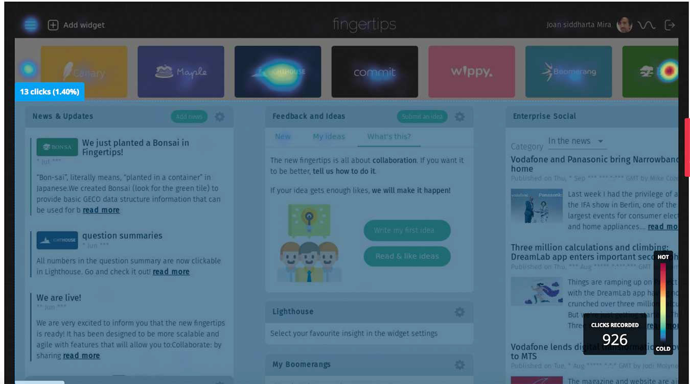
As part of the Research phase, we used Hotjar to create a Heatmap, to find out how good was the usability, also which were the content types that matter most. Users were interacting with the Dashboard tool, we can see that the main areas clicked are the thumbnails of each app.
.
We used Hotjar to invite participants, we ended up with a list of 55 participants. This way we could implement regular user testing every two weeks, having our own groups, all employees from Vodafone.
.
We used Hotjar to invite participants, we ended up with a list of 55 participants. This way we could implement regular user testing every two weeks, having our own groups, all employees from Vodafone.

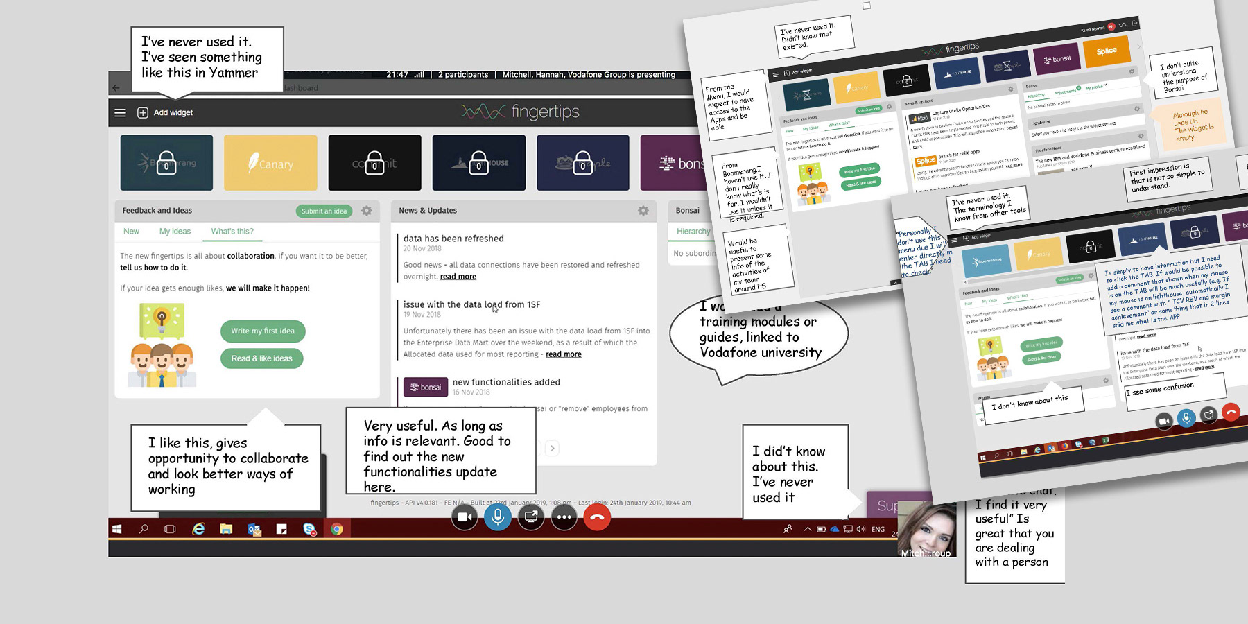
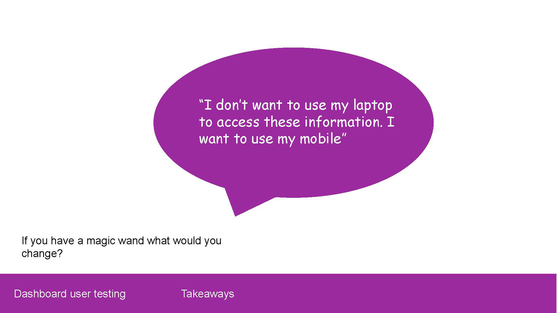
We did a user testing from the current design of the Dashboard, to find insights, pain points and learn about how the users they were using it. We invited 6 people to the test, above you can see some of the feedback that was given.
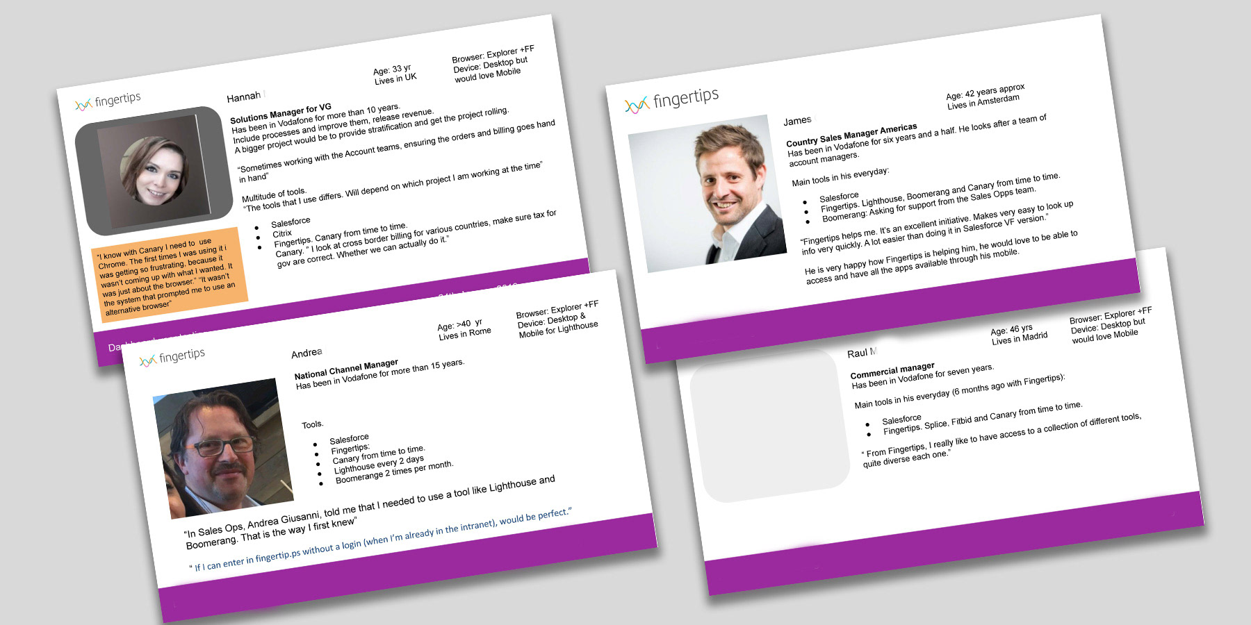
Find here in your left some exercises around building personas. Helping the Product team to understand who are our customers - users, and how can we help them to be more satisfied around the Fingertips platform.
Design
After the Research we had a good mix of business and user goals:
- Ensuring that has a great usability and legibility
- Removing frictions that currently has ( request access, FAQs )
- Primary actions are: request access to app, access an app, view all apps, ask for support.
The followed a Lean UX approach to iterate quickly.
- Visual language should be on brand
- Removing frictions that currently has ( request access, FAQs )
- Primary actions are: request access to app, access an app, view all apps, ask for support.
The followed a Lean UX approach to iterate quickly.
- Visual language should be on brand
Validation of new design proposals - testing

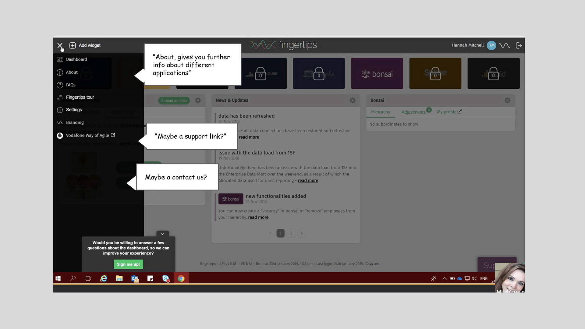
New Design proposal was tested, with 6 participants. Above you can see screens of some of the user journeys and points that we wanted to clarify and some feedback.
I was responsible to create and conduct the moderate remote testing. Creating the script and inviting employees to the session.
Main areas to test were:
- Improve the visibility of all the apps available,
- Improve how to ask for access permission. Previous design was very confusing, users were lost in the way.
Visual Design, UI and Design systems
The problem that the re-design was trying to solve was the lack of consistency among the different apps, interactive patterns and visual style. By having different patterns, components, and so many different styles, experience wasn’t intuitive enough and cognitive effort was higher than normal. Also customers wouldn’t associate an app to the Fingertips family, as there were too many visual differences. The images below show a new visual language more connected with Vodafone, and trying to align all the apps. This work is related to the Design System that I helped to create.


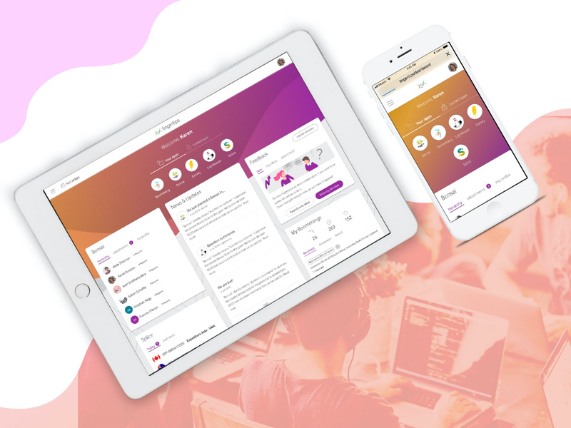
Find above the final Designs, UI phase.
The approach has been trying to bring Vodafone visual language to Fingertips
The approach has been trying to bring Vodafone visual language to Fingertips
My tasks
UX perspective
- Drive regular user testing, understanding the customer, collate and analyse data, conduct user research implement UX designs and help effectively utilise KPI's.
- Sketch & prototyping
- User Research strategy. By implementing a Research plan, and ensuring every two weeks Fingertips platform had some user testing, to feed the backlog.
UI perspective
- I worked around the RWD for Mobile, Tablet and Desktop, selecting grids, choosing the right typography, working around the spaces.
- The look and feel presented in the final designs comes from a result of working on another project - Creating a new brand-style guide
- The look and feel presented in the final designs comes from a result of working on another project - Creating a new brand-style guide
- Helping to create a live Design-system. Creating UI graphics including icons, info-graphics, illustrations and graphic assets for use in products