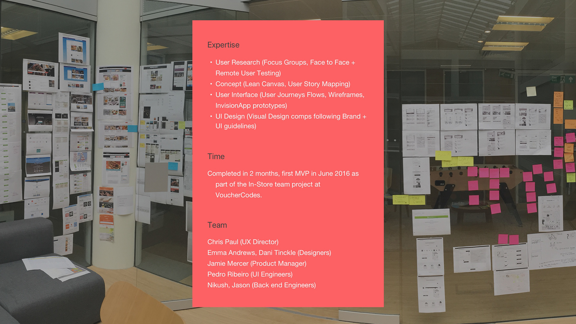
Date: June 2017 Duration: 8 weeks
Skills: User Research, Interaction Design, Testing, Design Sprints, Design System, UI Design
Team: 12 people formed the product team. Front end and backend engineers, BA, QA, Project Manager and I was the lead designer.
Software: Slack, Jira, Lucidchart, Hotjar, Invision, Sketch, Creative Suite.
Skills: User Research, Interaction Design, Testing, Design Sprints, Design System, UI Design
Team: 12 people formed the product team. Front end and backend engineers, BA, QA, Project Manager and I was the lead designer.
Software: Slack, Jira, Lucidchart, Hotjar, Invision, Sketch, Creative Suite.

Brief
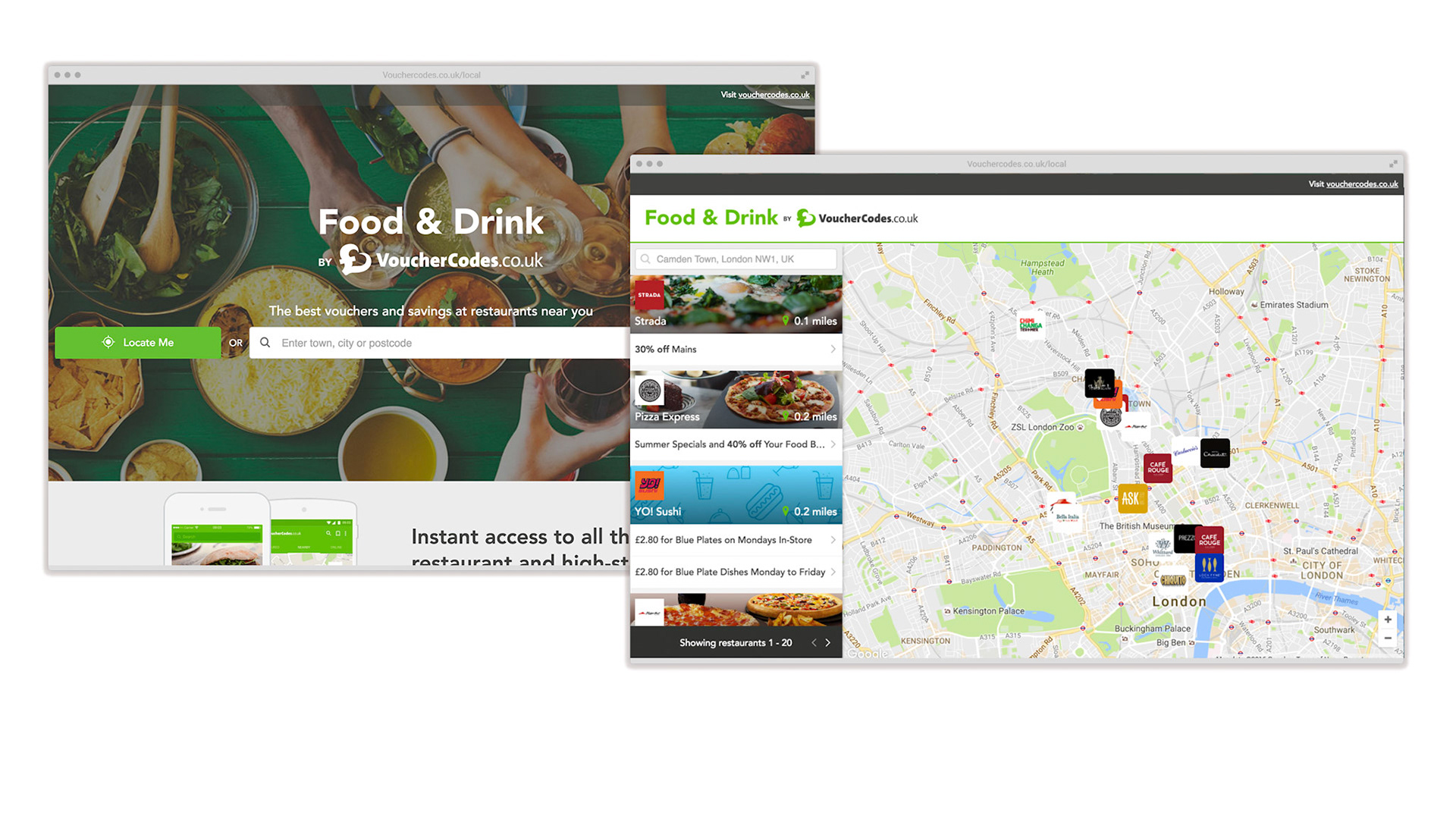
VoucherCodes is a leading UK savings destination. Brings together the best voucher codes, deals and sales for thousands of leading online and high street stores. Quarterly Roadmap suggested to work around the huge potential of Food and Restaurants, offering great ways of saving. The UX team was leading this project.
Problem Statement
In-Store Food and Restaurant discounts were not being used much in the website, the section had a low performance, despite the fact they had great content. On the other hand the same content had much better performance in the Voucher-Codes App (IOS and Android) has higher KPI’s. This was a whole area to be research and developed which would benefit the customer and the business through the website.
Research
Focus group
The in-house UX team lead the process, starting with a focus group to determine peoples in-store shopping behaviours and whether people wanted to use vouchers in that journey.
The sessions help to assess the respondents’ dining-out journeys and their relationship with voucher sites. Around sixteen participants took part.
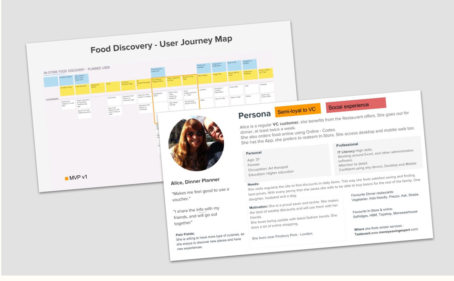
Journey
Respondents typically based their decision on which eatery to dine at on several factors, most importantly, and in order of importance: the location (how far they would need to travel); the type of cuisine (Fast-food, Chinese, Indian, etc); and the price-bracket of the restaurant; although members of the group were keen to emphasise that they weren’t purely price-driven, and this was a lesser concern.
The in-house UX team lead the process, starting with a focus group to determine peoples in-store shopping behaviours and whether people wanted to use vouchers in that journey.
The sessions help to assess the respondents’ dining-out journeys and their relationship with voucher sites. Around sixteen participants took part.
Journey
Respondents typically based their decision on which eatery to dine at on several factors, most importantly, and in order of importance: the location (how far they would need to travel); the type of cuisine (Fast-food, Chinese, Indian, etc); and the price-bracket of the restaurant; although members of the group were keen to emphasise that they weren’t purely price-driven, and this was a lesser concern.
Saving - Eatery Driver?
- Clear preference for restaurants which offered vouchers,
- User would feel uncomfortable presenting a voucher in an up-market restaurant or during a date/business lunch.
- Respondents were familiar with various voucher-websites but they struggled to identify the brands. Low brand awareness with VoucherCodes.
- User would feel uncomfortable presenting a voucher in an up-market restaurant or during a date/business lunch.
- Respondents were familiar with various voucher-websites but they struggled to identify the brands. Low brand awareness with VoucherCodes.
It helped us to understand what are the main features that they appreciate when they go out. User Research gave us the direction towards 5Ws + H.
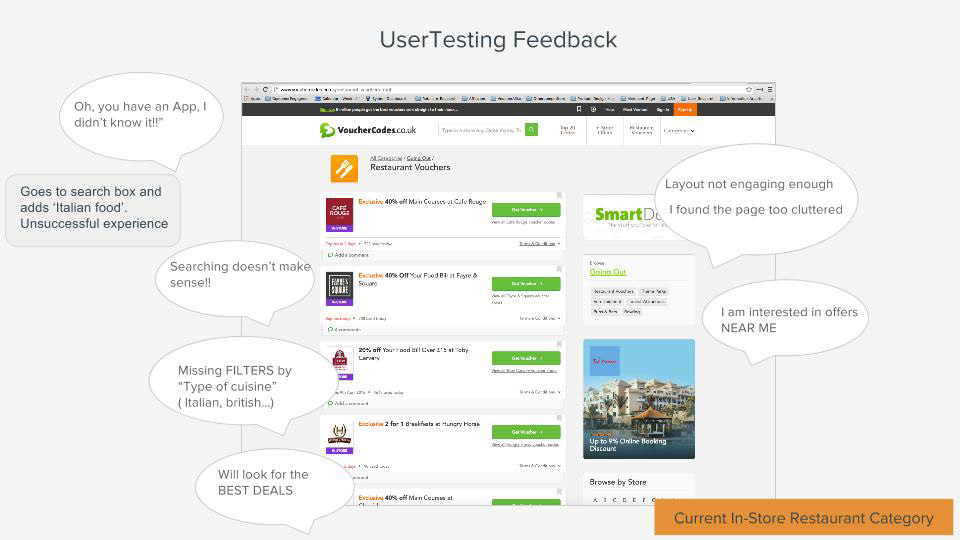
Usability Testing
Current Restaurant pages were tested with customers in order to find insights and feedback which would inform design decisions.
Usability Testing
Current Restaurant pages were tested with customers in order to find insights and feedback which would inform design decisions.
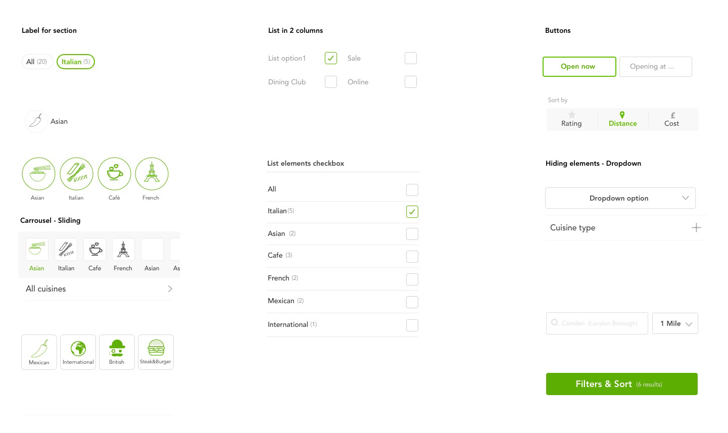
Features Prioritisation
Before designing the digital experience we identified key features that would be crucial to my user in achieving their goal.
Considerations
Time — the timeline to complete the research, planning, design, and testing of this web app was eight weeks.
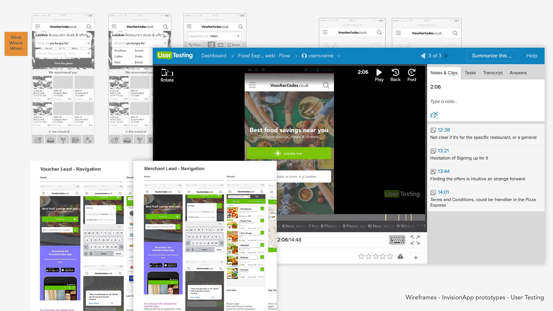
Design & Testing
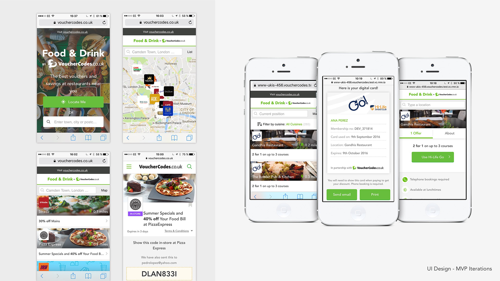
After knowing the insights and the way of thinking from the users, we end up with a set of pages, short journey to be able to select from a range of restaurants.
Goal: Create a site for hungry people, looking for a quick and easy way to save while they are planning to go out to eat. Should have an engaging experience, user friendly and lifting the current brand.
Early days sketches and prototypes in paper were done to get the layouts and flows to ensure interactions were intuitive. Beginning with low resolution wireframes, sharing and collaborating with a team of project managers, engineers and designers. Iterating wireframes towards higher resolution, preparing prototypes with Invision.
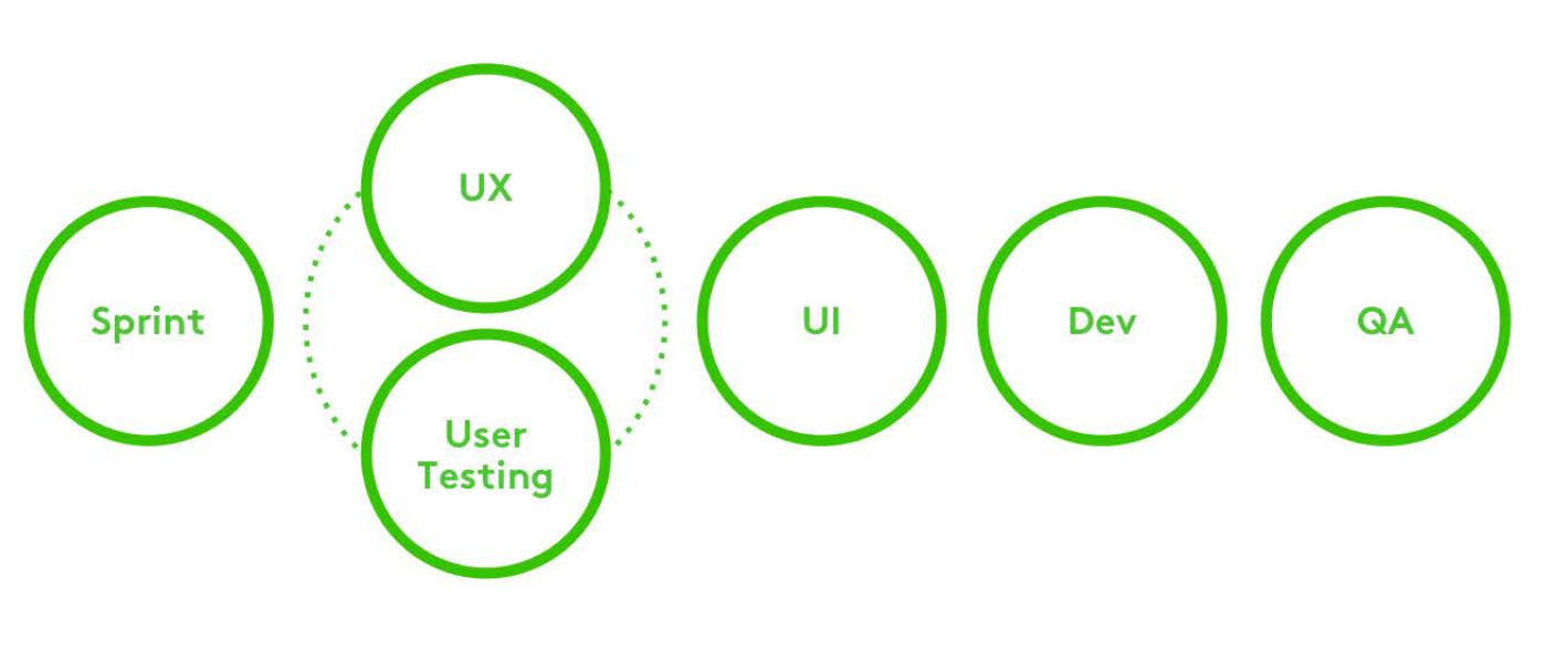
Teams and Roles
The UX team was part of the Product department, inside the team we were five designers, three of them UX and two UI. My role for the project was to be the lead designer, together with the product owner we were ensuring to make workshops for the Ideation phases, inviting other stakeholders like front end developers, SEO, marketing, content managers. Ensuring everyone was involved in the design and on the same page.
I was responsible for interpreting insights from Focus groups. Gathering the project requirements, architecting the web section, prototyping and creating visual assets for development. Early days sketches and prototypes in paper where done to get the layouts and flows to ensure interactions where intuitive. Iterating designs after feedback to create and launch the MVP.
Discovery: User Research (Focus groups), Analytics and Heuristics, Competitive Analysis
Protopersonas
Ideation : Sketches,Wireframes, Information Architecture, Prototypes
Design: Design Sprint, Style Guides, High-Fidelity Visual Design,Rapid Prototyping, Mockups, A/B Testing
Validation: User Testing (Guerrilla, Face to Face, Remote), Iterative Design
Protopersonas
Ideation : Sketches,Wireframes, Information Architecture, Prototypes
Design: Design Sprint, Style Guides, High-Fidelity Visual Design,Rapid Prototyping, Mockups, A/B Testing
Validation: User Testing (Guerrilla, Face to Face, Remote), Iterative Design
Conclusions and Results
The First MVP was launched and after the first month Frequently visitors raised a 2% and final redemptions increased. Mobile site traffic increased 1%.
Key challenges and pain point in this project was the SEO constrained, so in terms of information architecture and terminology we had to stick to Food and Drink.
It was also a struggle to define the first outcomes of the MVP, to find a balance between the basic and a bit more of extra value. Engineers had their voices and backlogs limitation of time, so decision were made based on that.
It was also a struggle to define the first outcomes of the MVP, to find a balance between the basic and a bit more of extra value. Engineers had their voices and backlogs limitation of time, so decision were made based on that.
Find below a home made video done by me with the purpose of sharing among my team and other stakeholders from the company. Have a look and hopefully will illustrate the aim of the service. Getting the best deals and food discounts nearby.